OpenJung Visual identity
Brand & identity
A shared reference for everyone designing, writing about or contributing to OpenJung. These are the choices that keep our work recognizable.
Version 1.4
01Name & positioning
Free, open-source personality exploration
Curiosity, with context
Help people notice patterns and ask useful questions. A type is a starting point for exploration; leave room for change and individual differences.
Open about the method
Make the questionnaire, scoring and limitations easy to find. Keep measured preferences, theoretical interpretation and fictional stories clearly distinguished.
Useful in everyday life
Connect a result to a small action, a conversation or a reflection. Give people a reason to return beyond a four-letter label.
- Brand name
- OpenJung
One word. Capital O and J. Keep this spelling in every language.
- Canonical website
- openjung.org
Use this domain in public links, credits and social profiles.
- Short descriptor
- Free, open-source personality exploration
Use for an introduction, a directory listing or a project description.
- Search context
- Jungian personality test · 16 personality types
Describe the experience in plain language. Use MBTI only where the comparison or discussion calls for it.
Open Jung, OpenJUNG and OpenMBTI are not current brand spellings. The older repository and infrastructure names are historical identifiers. OpenJung is an independent project, not an official MBTI assessment or an endorsement by another organization.
OpenJung is a free, open-source space for personality exploration and everyday reflection. Explore 16 personality types, understand your preferences, and find a small step to try in daily life. No account required.
02The prism
Four flat facets, one open center. The four colors refer to E/I, S/N, T/F and J/P. The open center leaves room for the person behind the preferences.
Clear space
Leave at least one quarter of the symbol’s width clear on every side. Keep the mark and wordmark comfortably separated.


Small applications
Use the supplied favicon files at 16–32 px. In an interface, use the symbol at 24 px or larger. App icons retain their supplied backplate and safe area.
- Preserve the square proportions, facet order and open center.
- Use the original colors on a quiet background with enough contrast.
- Keep the symbol flat: no stretching, rotation, extra outlines, gradients or shadows.
- Pair the symbol with the OpenJung wordmark for a first introduction. The symbol alone works in familiar, compact contexts.
- Header, footer and interface specimens use the same logo: upright Open, italic Jung, and the prism’s subtle tonal finish. Keep the logo left-to-right; accessibility modes remove italics or the finish as needed. Exported icons and result cards keep solid fills.
03Color
A dark, quiet canvas. Warm, readable text. Amber draws attention to the next action; the four dimension colors explain the personality model.
Canvas
#0A0A0B --color-canvas Surface
#141416 --color-canvas-light Cream
#FFFEF5 --color-cream Soft text
#E0DFD7 --color-cream-soft Muted text
#A8A79F --color-cream-muted Amber accent
#FBBF24 --color-accent Dimension colors · keep the mapping
#8B5CF6 #10B981 #F97316 #0EA5E9 Use dimension hues for illustrations, indicators and larger accents. Small text needs a readable foreground. Pair color with a label, and honor high-contrast and color-vision settings.
CSS
:root {
  --color-canvas: #0a0a0b;
  --color-canvas-light: #141416;
  --color-cream: #fffef5;
  --color-cream-soft: #e0dfd7;
  --color-cream-muted: #a8a79f;
  --color-accent: #fbbf24;
  --color-dimension-ei: #8b5cf6;
  --color-dimension-sn: #10b981;
  --color-dimension-tf: #f97316;
  --color-dimension-jp: #0ea5e9;
} 04Typography & layout
Instrument Serif gives headlines and the wordmark their character. Sora keeps navigation, body copy and controls clear.
Headlines & wordmark
Aa&
Instrument Serif
See yourself more clearly.
Body & interface
Aa01
Sora
A little more understanding. One small step.
- Use the display face sparingly. Keep longer reading and interactive labels in the body face.
- Chinese pairs upright Noto Serif SC/TC headings with Noto Sans SC/TC body text. Japanese uses Noto Sans JP. Use appropriate local glyphs and fallbacks; never force Latin italics or letter spacing onto another script.
- Use an editorial layout: generous space, thin rules, neutral surfaces and mostly square corners. Reserve dimension hues for labeled dimension information. Avoid floating shapes, rainbow rules and glows.
- Give controls at least a 44 px target, visible keyboard focus and a reduced-motion experience. Accessibility preferences take precedence over decoration.
05Voice & expression
Warm, curious and precise. Speak to a person with choices. Explain what a result can suggest and where its limits begin.
Results
Your answers suggest a preference for quiet reflection. Does that fit your experience?
You are an introvert, so you cannot lead.
Evidence
This questionnaire offers a starting point for reflection. Read how scoring works and what remains uncertain.
A scientifically proven diagnosis of your true personality.
Actions
Try one small action this week, then notice what helped.
Unlock your perfect life with your rare personality type.
Playfulness
A cat-inspired character for your type, with a fictional everyday story.
Your cat breed proves who you really are.
06Personality appearances
One OpenJung identity, with different ways to meet the 16 types. The control is called Appearance: Classic / Cats.
Classic
Dark canvas, geometric forms and clear dimension colors.
Explore this appearance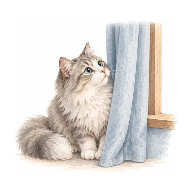
Cats
Warm paper, watercolor portraits, ink-colored text and softer controls.
Explore this appearanceAn appearance changes the presentation and fictional character layer. The questions, scoring, assessment version and saved result keep their meaning. The OpenJung name and prism remain the parent identity.
Cats uses artwork from PurrJung to playfully describe human personality preferences. It does not assess a real cat’s personality.
07Our brand family
OpenJung is the parent brand. Our projects share curiosity, clear explanations and respect for individual experience, while each keeps its own purpose and visual identity.
PurrJung
PurrJung belongs to OpenJung. It helps caregivers observe real cats, using a warm paper palette and natural watercolor illustrations.
PurrJung brand guide ↗Open ADHD
Open ADHD belongs to OpenJung. It offers everyday tools, learning resources and self-reflection for adults, with an organic loop mark, sage colors and Fraunces / Nunito typography. It does not provide a diagnosis.
Open ADHD brand guide ↗Use “An OpenJung project” with a link to openjung.org as the parent credit. Each project states its own privacy, evidence and licensing terms; belonging to this family does not imply shared health records or clinical validation.
08Brand assets
Use the current exported assets. The logo is a transparent SVG; icons include their intended background and spacing.


When presenting this project, preserve the name and artwork and link to openjung.org. Do not imply an official partnership or endorsement. Third-party artwork and fonts retain their own licenses. The OEJTS questionnaire has separate source and licensing terms.
OEJTS questionnaire source & license